
A blog post by Publishing Intern Emma Solis

Lineup of Modern Memoirs book spines with logos, roughly ordered from earliest to newest

Current Modern Memoirs logo, using Futura font
“What is our logo?”
This was one of the first questions I asked when I started my internship at Modern Memoirs. Design plays a huge role in the company’s work on client books, which is why I found the logo, which creates the very first “story” of the company Modern Memoirs in the minds of potential clients, so intriguing. I had to know: how was it created or chosen? And how is it effective?
I went right to the source to find answers by reaching out to company founder, Kitty Axelson-Berry. Kitty shared that at the very beginning of Modern Memoirs’ existence in the mid-1990s, she experimented liberally with marketing materials. “I went off in a lot of different directions, trying this, trying that. What was going to work for this business?” she said. It was immediately apparent to me that while Kitty is deeply cognizant of the power of design, she never treated it as a dull obligation or a staid intellectual exercise. She even hand-painted watercolor business cards sporting two cherubs, but she wasn’t quite satisfied with the imagery. When I asked if she’d had artistic training, Kitty protested, “Oh, no, no, no. I just like to have fun!”

Early business card with die-cut logo, one of Kitty Axelson-Berry’s design experiments
Kitty next told me that around the time she was starting up the company and experimenting with the cherub paintings, her then-brother-in-law established a marketing firm. He offered to create a free logo for Modern Memoirs as a sample of his work and came up with a design that has stood the test of time. The logo, which Kitty affectionately dubbed the “thoughtful image,” or “little guy,” was perfect. Though it would be tweaked slightly as time went on, and Kitty would continue experimenting with the image—even creating die-cut business cards, for example—the logo has stayed basically the same for over twenty-seven years.

Early Modern Memoirs logo, using the font Copperplate Gothic
In the logo, a seated figure with short, curly hair wears a loose garment around the hips, and hunches over with knees bent. Kitty said she loved the image from the start for its “androgynous” quality. “This was in 1994, when all ‘cis’ meant was ‘coated on one side,’ in reference to a kind of paper stock,” she explained. Kitty regarded the image as a universal human figure, evoking the variety of life stories published by Modern Memoirs. Furthermore, despite its evocative universality, the logo is not merely a direct pictograph; it may communicate something slightly different to each viewer. Its ambiguity may help draw someone in for a longer look, too.

Logo in purple and yellow, used in early brochure
As for the colors, Kitty loved the purple-and-yellow palette designed by an early freelancer for a Modern Memoirs brochure but wondered whether the colors made the company look “respectable” enough. For a time, she switched to a more sober navy-and-yellow palette, before returning to the original. “The colors are a little bit soft, a little unusual in a quirky way, and it turned out that we had a lot of clients who wanted quirky. And those were the people that we got along with so beautifully, anyway.”

Modern Memoirs published book using Celtic-style font Rieven on the cover
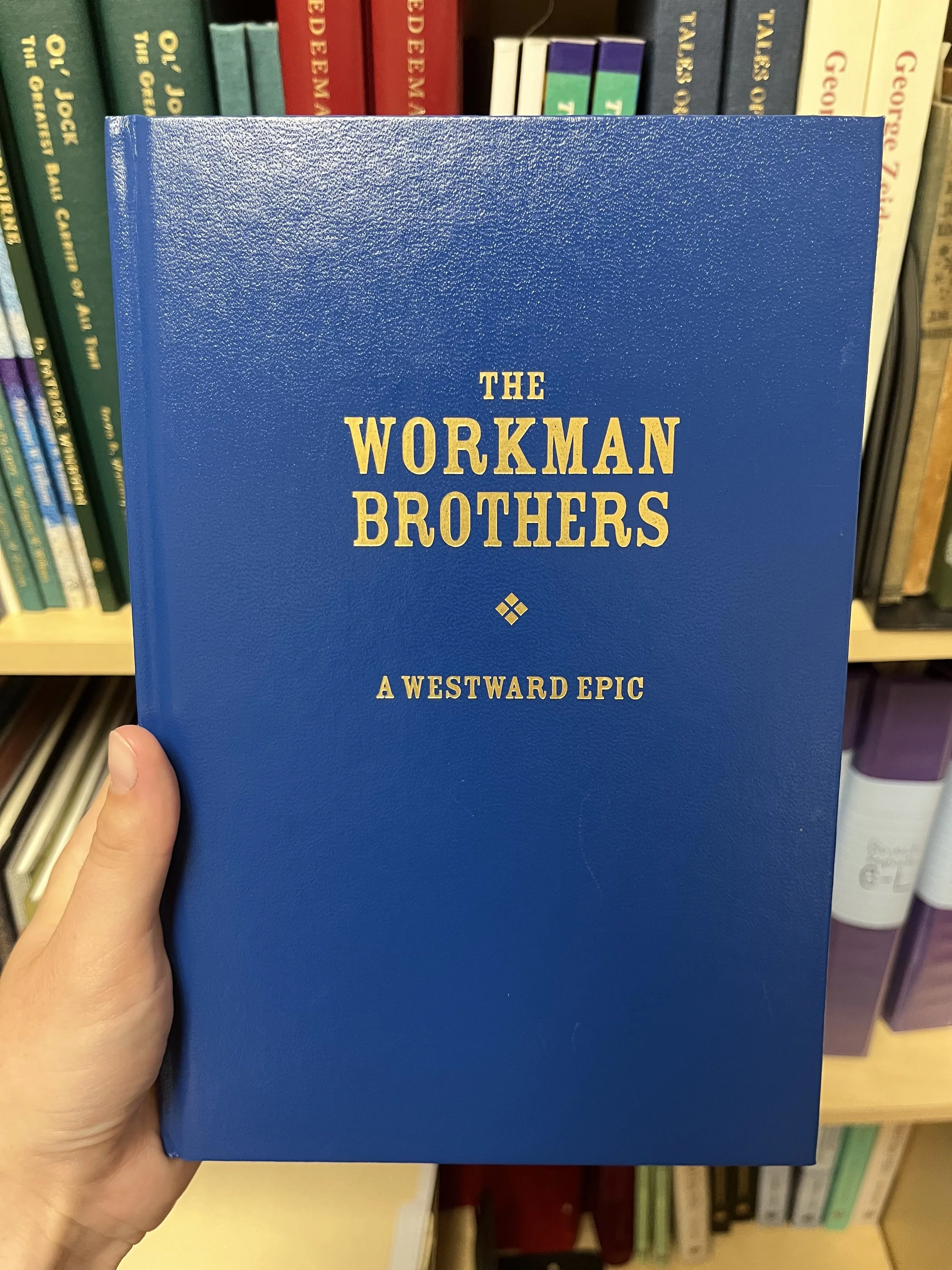
Modern Memoirs published book using Western-themed font Durango on the cover
Fonts, too, are deeply significant, through their histories and effects on the reader. For branding consistency, Kitty eventually settled on Copperplate Gothic, a stately 1901 font made in Massachusetts, for all displays of the Modern Memoirs name. More recently, the company changed to Futura, a sleek, ultra-modern font also chosen for the lunar plaques placed on the moon by Apollo 11. Our discussion of the logo fonts led Kitty to describe her search for special fonts for clients’ book covers that would personally connect to the author’s memoir or family history; for instance, why not Rieven (a Celtic-style font) for a book about a Scottish family, or Durango font for a westward migration tale?
Ultimately, although it may seem as if everything just fell together naturally to create the Modern Memoirs logo, Kitty had a strong vision and a willingness to experiment. She knew she wanted to stand out a bit and attract the clientele she most enjoyed: the ones who wouldn’t mind a bit of quirkiness.
Like a good logo or palette, a well-made book may look natural, as if no work went into it at all; the reality is anything but! The exterior and interior fonts, leading, dimensions, paper, colors, and cover materials all tell a story—the very first story that the brain formulates before reading a single word of text. (See “Material Matters: A Blog Post by Lauryn Small” for more on this topic.) You might pick up a book and think intuitively, “This cover is leather; it reminds me of a big, old, comfy armchair.” Or, “This cover imagery looks gentle; I think the contents will be soothing.” Ideally, when readers hold a book in hand, they get a sense of how beauty and function intertwine seamlessly, as the physical book works with the text to create the full memoir, the instrument that illuminates the narrator as surely as a logo can evoke the core qualities of a business.